Dore Festival Brand System

Project Overview
For this project, I was tasked with creating a visual identity and promotional campaign for a fictitious music festival derived from a blend of two distinct musical genres. I selected Indie Pop and was randomly assigned French Pop.
Logo & Brand Identity
The festival is named Doré, which means “golden” in French—capturing both the sunny atmosphere.
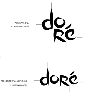
Lockups
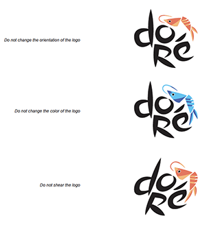
Logo limitations
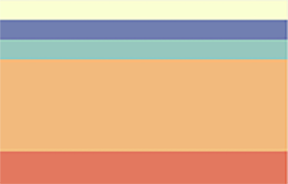
Brand colors
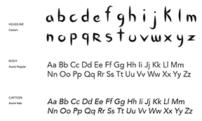
Brand typography
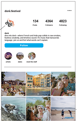
Brand social presence
Poster

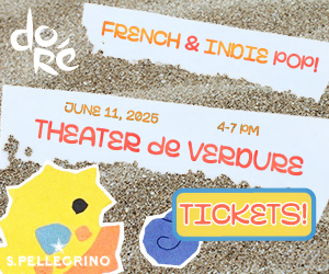
Inline rectangle
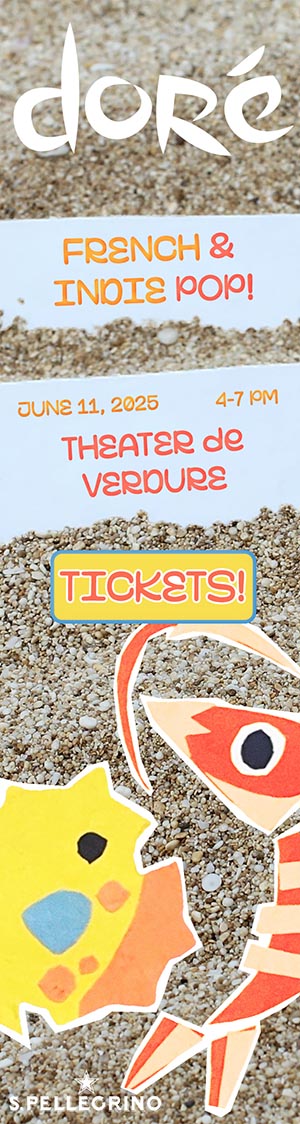
Skyscraper
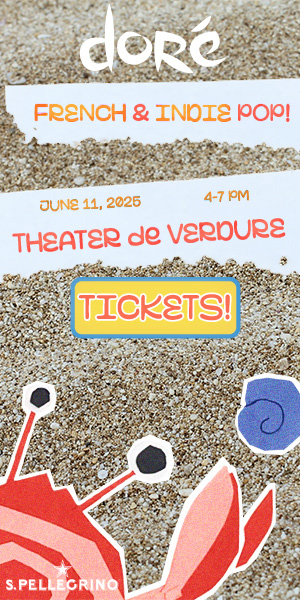
Half-page
My choice of Lacoste and San Pellegrino as sponsors was strategic: both align with the lifestyle...
Co-Branding Strategy & Product Selection
I chose three well-known brands whose identities align with the festival’s cheerful, sun-drenched aesthetic and outdoor experience:
- SunChips (RTE food): The bold, sunny energy of SunChips paired naturally with the Doré identity.
- San Pellegrino (RTD beverage): As an existing sponsor, San Pellegrino added sophistication.
- Conservation Fundraising Wristbands: To unify the theme of ocean life, I created wearable wristbands that fundraise for conservation efforts.
To unify the items, I designed a tote bag as the container item—ideal for festivalgoers outdoors in the sunshine.